Usually it makes no sense to fight against normal distribution. But there are setups which have got a high probability of unexpected behaviour. Volatility can be the key to future market movements. Continue reading
Author: Kahler Philipp
Weis Wave indicator code for Tradesignal
The Weis Wave indicator combines trend and volume information. It seems to be of some interest for timing short term market reversals. Here comes a version of this indicator for usage in Tradesignal. Continue reading
Tradesignal Implied Volatility and IV Percentile Scanner
Implied volatility data is key in options trading. This article shows how to access free volatility data in the Tradesignal software suite. Continue reading
IV Percentile – when to sell volatility
Volatility trading: when to buy and when to sell volatility Continue reading
The Hindenburg Omen – Stock Market Crash Ahead?
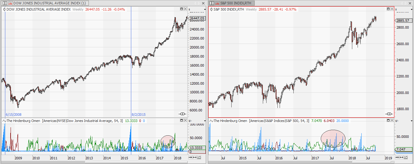
The Hindenburg Omen is an indicator which is believed to forecast market crashes. Unfortunately it does not work, but the idea behind this indicator is worth to be discussed. Continue reading
Implied vs. Realized Volatility for NASDAQ100 stocks
(1) You shall only trade when the chances are on your side Continue reading
Distribution of Returns
“Tomorrow never happens. It’s all the same fucking day, man. ” Janis Joplin Continue reading
Bet on Bollinger
Ever since John Bollinger introduced his Bollinger Bands in the early 1980s the bands have been a favourite indicator to all technical trades. This article is about the prediction capabilities of Bollinger bands. Continue reading
Scanning for Support and Resistance Probabilities
I have been in search for a signal I could use for a short vertical spread or naked short option strategy. So my main concern has been to find a level, which will most probably not be penetrated over the next few bars.
This is what I came up with. Continue reading
Weekend Reading Recommendation
The markets will go up and down, and usually it’s not my business why they do it, I am just interested in making my luck with a position on the right side of the trade. Continue reading
Backtesting Market Volatility
If you want to trade volatility, you can place a bet on the option market. Just buy an at the money put and call, and at expiry day you will either win or lose, depending on the actual market move since you bought the straddle and the price you paid for the straddle. To put it simple, if the market moves more than you paid for the two options you will win, otherwise you will lose. This article is about a back test of volatility. Continue reading
Demystifying the 200 day average
The 200 day average is considered as a key indicator in everyday technical analysis. It tells us if markets are bullish or bearish. But can this claim be proved statistically, or is it just an urban legend handed down from one generation of technical analysts to the next? Let’s find out and demystify the 200 day moving average. Continue reading
Google EOD csv stock price data download
Sometimes my data provider has not got the data I am looking for. Searching for downloadable csv data I recently came across google spreadsheets. It provides an easy way to get historical stock price data. Save it as csv and use it with your Tradesignal. Continue reading
Money for nothing
We already had a post regarding the mean reverting tendency of Volatility, now it`s time to make some money using this information. Continue reading
Seasonal trouble ahead
If a bitchy prime minister and a crazy president weren’t enough, for the upcoming months the seasonal chart is also indicating further price setbacks. Continue reading
KVOL Volatility part 2
How to calculate volatility based on the expected return of a straddle strategy has been shown in part 1 of fair bet volatility KVOL.
Using and Displaying K-Volatility:
KVOL uses the given amount of historic returns to calculate an expected value of an at the money put and call option. The sum of these prices are the historic fair value for implied volatility. It can be used to compare current market implied volatility to historic fair values.
Beside calculating KVOL for a specific return period it can also be used to show it as a projection indicator on the chart.
The example on the chart gives such an expectation channel for the s&P500 at the beginning of each month. The 250 days before are used to calculate KVOL. The line underneath the chart is running KVOL for 13 trading days.
Simplified trading:
to win, with higher volatility expected: you would have bought a straddle at the beginning of the month, expiring at the end of the month. You should not have paid more than a KVOL for 25 bars (working days to expiry) would have suggested. You win if the chart is outside of the projection at the end of the month.
The shown example uses the 250 daily bars before the beginning of the month to calculate the returns and the price of KVOL. The projected lines represent the winning boundaries of the straddle at expiry.
Statistics of VIX
The CBOE volatility index VIX measures the market’s expectation of future volatility. This article will show you some key statistics of VIX and help you to decide if it is better to buy or to sell volatility.
Statistics of VIX
The spikes to the top and the long phases of relatively low volatility are reflected in a left-leaning distribution diagram and a long tail towards the higher levels. The median value is 17%, meaning 50% of the prices are above (below) this level.
The next chart shows the distribution of returns over 25 trading days. The median price movement being slightly shifted to the negative area shows the mean reverting characteristics of volatility.
Buy or sell volatility?
Analysing the level of VIX and the returns afterwards yields an even more interesting picture:
The green line gives the 25 bar percentage returns of VIX, with VIX noting above 25, the red line gives the returns with VIX below 15. Observe the median of the two lines:
The median 25 bar return with VIX above 25 (green) is around -15%, only 20% of the returns are positive when VIX is currently above 25. Sell volatility.
The median returns with VIX currently below 15 (red) is above 0% and with a fat tail to positive returns. Buy volatility. (data from 2004-2018)
Adverse movement of VIX
The above chart suggests that going short on volatility, if VIX is above 25, seems to be a good idea. But it is not without risk. The chart below shows what can go wrong during the next 25 days. The distribution diagram gives the maximum adverse movement of the VIX, with VIX currently trading above 25.
The green line, VIX currently above 25, shows a +10% median maximum up movement over the next 25 days. So do not expect a short vola position to be without risk. Some adverse movement has to be expected.
On the other side, the distribution of the maximum loss of the VIX during a 25 day period shows a median of below -20%. This represents the profit potential of a short volatility position.
Conclusion of VIX statistics:
If you plan to short volatility wait until VIX is trading above 25. If you want to buy volatility, do so if VIX is trading below 15.
The analysis has been done using the tradesignal software suite.
Kahler’s fair bet volatility
Volatility is a measure of risk. It describes how far a commodity will most probably move within a given period of time. The most common measure for volatility is historical volatility. But I do not like the complicated formula for standard deviation.
There has to be a better way to explain and calculate volatility….
Implied Volatility
The options market has got a perfect measure for volatility. Done without formulas, just by demand and supply. And as I believe in efficient markets, the option markets fair price for volatility will be my starting point.
To get the price for volatility at the option market you just have to place a bet. Assume you want to know the (expected) volatility for the next 30 days, then you would just add the price for an at the money put and call with 30 days to expiry. Option traders call this bet a straddle, and you would win if the market moves more than the price you have payed for the (european style) put and call.
The fair price for a volatility bet
Implied volatility and this Straddle bet is the starting point to calculate my own volatility measure.
The fair price for this bet is, when neither the buyer nor the seller of the bet has got an advantage. In the long run it should be a zero sum game game for both of them. Calculating the fair bet price for a straddle is the idea behind my volatility measure.
Think about a simple coin flip game. If you bet on head you can either win 1€ if head is up or nothing if tail comes on top. What would be the fair price for such a bet?
As head and tail got the same probability, the expected return of a bet on head’s up would be 0.5€. If I would sell you a bet on the next coin flip, I would charge you this 0.5€ to make it a fair bet. So you would either lose the 0.5€ if tail’s up, or win 1€ -0.5€ if head’s up. In the long run this would be a zero sum game for both of us. Do the same thing for the tail is up bet. It also got a value of 0.5€.
Historical Volatility vs. Kahler’s Volatility:
Historical volatility uses standard deviation of daily log returns to describe the volatility of the market. The standard deviation of this +1 -1 coin flip experiment would be 1€. The same would be true if you would buy a head’s up and a tail’s up bet; it would also cost you 1€. So for this simple example the fair bet based volatility is the same as the historical volatility.
But the market is not a coin flip. There will be some differences between historical volatility and KVOL fair bet based volatility.
KVOL vs. historical volatility:
The chart shows you a comparison between KVOL (blue) and historical volatility (standard deviation). On the chart shown above both calculate the volatility for 10 day returns, using the previous 30 bars as data sample.
As you can see historical volatility and KVOL are highly correlated.
But there are some major differences:
As an example in the end of 2017/beginning of 2018 KVOL starts to rise as the market is exploding to the upside. This is due to the virtual call used to calculate KVOL gains value. At the same time historical volatility stays low, as the market has got one direction and no setbacks.
Another advantage of KVOL is it`s response to singular events. As you can see on Sept. 3rd on the chart above the singular big red candle leads to a spike in historical volatility. It also raises KVOL, but not as much. As both indicators are calculated over the same period of bars they both got the same speed of change, but when you have a look at the scale you will see the advantage of KVOL: Historical volatility jumps from 0.2 to over 0.5 – it more than doubles just because of a single event. KVOL also raises,but only from 0.2 to 0.3.
For me this mild response to to singular events is the main advantage. Imagine a portfolio based on value at risk – would it really be useful to half the exposure just because historical volatility jumps after a single red candle?
KVOL – Tradesignal Equilla Code:
The code to calculate KVOL is simple and straightforward.
The inputs:
multi: just a multiplier, like you can display 1 or 2 standard deviations..
datapoints: The number of bars used to calculate KVOL
returnperiod: calculate the volatility for 1,2,3… bars
showresult: show the result as a percentage of the underlying or as an absolute number
show: show either kvol or the rank of kvol within the last 100 bars. This gives an idea if volatility is high or low
Meta: subchart(true); Inputs: multi(1.0), Datapoints(30), returnperiod(5), showresult(percent, absolute), show(result,rank); Variables:Kvol, i, rp,rc, rpsum, rcsum, call, put, hh,ll; rpsum=0; rcsum=0; for i =0 to datapoints-1 begin // loop over last bars rc=maxlist((close[i]-close[i+returnperiod])/close[i+returnperiod],0); // % return of call rp=maxlist((close[i+returnperiod]-close[i])/close[i+returnperiod],0); // % return of put rcsum=rcsum+rc; // sum of all %returns over time rpsum=rpsum+rp; end; call=rcsum/datapoints; put=rpsum/datapoints; Kvol=call+put; if show=result then drawline(multi*iff(showresult=percent,100*Kvol,Kvol*close),"KVOL"); hh=highest(kvol,100); ll=lowest(kvol,100); if show=rank and (hh-ll)>0 then drawline(100-100*(hh-kvol)/(hh-ll),"rank");
keep researching…
A graphical approach to indicator testing
The first step in algorithmic strategy design usually is to find some indicators which give you an edge and tell you something about tomorrow’s market behaviour. You could use a lot of statistics to describe this edge, but I like to take a graphical approach in indicator testing first, and only later on worry about the maths and statistics.
Scatter Charts
A scatter chart is a simple to read chart style to see the correlation between two input values. A regression line on the scatter chart gives you a visual idea if the two securities are positively or negatively correlated, the “cloud structure” of the scatter points tell you if this correlation is tight or loose.
This sample scatter shows the correlation between the DAX and DOW levels, and it can be easily seen that these two markets are tightly correlated in a positively way.
The horizontal scale is used for the second security (DAX), the vertical scale is used for the first security (DOW). This chart type is predefined in Tradesignal, just drag&drop it onto the securities on the chart and select the right amount of data to get the analysis you want to see. (eg. 2000-now). If you see a tight and positive correlation like on the chart above, It might be used to select the instrument you want to trade. If market A is easier to predict than market B, select A.
Scatter on Indicators
Although a scatter chart is usually used to show the correlation between two markets, it can also be used to show the correlation between two indicators.
The chart above shows the correlation between digital stochastic and momentum. Have a look at the clustering of points in on the right side of the scatter, a high level in digital stochastic usually goes with a high momentum. This insight enables you to get rid of momentum, as digital stochastic is easier to read than the shaky momentum. Less indicators = less parameters = less curve fitting.
Scatter prognosis
Doing this analysis and getting rid of parameters is great if you want to minimise the dangers of curve fitting, but it does not tell you if your indicator is of any use at all, when it come to describing tomorrows move of the market. Surely it is valuable insight that a high level of stochastics corresponds to a high momentum, but does a high momentum today also mean that the market will move up tomorrow? And this question about tomorrow is the key question I ask myself when searching for some edge.
To get a glimpse on the prognosis quality of an indicator we will have to add some colour to our scatter chart. This colour tells me what the market has done after a specific indicator level has been reached. Green for an up move, red for a down move, black for not decided by now.
This chart shows the prognosis quality of the stochastic indicator. The left chart shows the 1 day prognosis of a 5 day stochastic, the right chart gives you the 5 day prognosis of a 21 day stochastic. Observe the clustering of the red and green dots. (black for not decided by now) As you can see on the left chart, the one day prognosis using a 5 day stochastic is not the thing to do. Regardless if stochastic is high or low, you get a nice mixture of red and green dots. This means the market, at a given stochastic level, sometimes moved up, sometimes moved down. Not this behaviour is not very useful for trading. Only in the extreme, near 0 and 100, this indicator seems to implicate a bearish next day movement.
The right chart, showing the longer term prognosis of a long term stochastic seems to be more useful. High levels of the indicator also show positive returns on the 5 days after, unfortunately you can not reverse the logic, as low indicator levels give a rater mixed prognosis. This visual analysis can give you an idea which areas of the indicator might be useful for further analysis.
A one dimensional analysis like on the chart above could also be done without this scatter chart. Going from one dimension to two dimensions is more useful, as it directly can be translated to do a kNN machine learning trading strategy. Have a look at the following chart. It shows the scatter of two indicators and the implication on the next days market move.
Lets start with he right chart. As you can see the red and green dots are evenly distributed, meaning there is no useful correlation between the used indicators and the movement of the market on the day after. If you would use a kNN algorithm with these two indicators, I would bet it would not return great results. Even if you would get a positive return, it might just be a lucky hit or curve fitting.
The opposite is true for the chart on the left. Here you can see some nice clustering of the red and green dots. Low indicator levels seem to predict a bearish move, high indicator levels result in a bullish move on the next day. A distribution like this is the perfect starting point for investing some time in a kNN machine learning trading strategy. The kNN algorithm would give you a strong prognosis with high or low indicator levels, and most probably only a weak or no prognosis when the indicators are around 50. The returns will be stable, no curve fitting problems should be expected.
Conclusion
Using a scatter chart can give you a nice visual indication if your indicator might be useful for a prognosis of the next days market move. This is valuable insight, as you can see the whole data universe with one glimpse, even before you do a thoroughly statistical analysis. Numbers can deceive you, pictures usually tell the complete story.
Tradesignal Equilla code:
Machine learning: kNN algorithm explained
I always thought that inspiration and experience are key factors in trading. But every time my chess computer beats me without any inspiration, just by brute force, I get my doubts. This article will be about a brute force approach in trading. The kNN algorithm.
Rule based trading
Rule based trading – algorithmic trading, is just a name for a set of if..then rules which will define the machines trading decisions. e.g. if the market crosses below the 200 day line, then short 100 contracts. If the market rises by 2% then exit the position. Easy stuff like this… (for the beginning)
This article will be a short introduction to machine learning. I will use a classic algorithm of machine learning to let my computer find a prediction for tomorrows market move. In the meantime I’ll have a glass of wine with some friends and let the machine do the job; At least that’s the idea, but can it be that simple in real life trading?
Unsupervised machine learning – kNN algorithm
The kNN algorithm is one of the most simple machine learning algorithms. Learning, in this case, is only a nice sounding label, in reality kNN is more of a classification algorithm.
This is how it woks:
The scatter chart above is a visualisation of a two dimensional kNN data set. For this article I used a classical indicators of technical analysis to do the prediction: a long-term and a short-term RSI indicator. The dots on the two dimensional scatter chart represent the historic RSI values at a given point of time.
Now have a look at the fat circled point. This point represents today’s value. It means, that today’s RSI1 has a value of 63, and RSI2 got a value of 70.
Additionally to the position on the chart the dots have got colours. A green dot means that the market moved up on the following day, a red dot shows a falling market on the day after.
We already know what has happened in history, so it is easy to colour the historic dots. But we do not know the colour of today’s dot, as it is not known where tomorrow’s market will end.
Based on the chart above, will it be a red or green dot? Will tomorrow be up or down? Should I go long or should I go short?
kNN – k nearest neighbours
To do a prediction of tomorrow’s market move, the kNN algorithm uses the historic data shown on the scatter plot above and finds the k-nearest neighbours of today’s RSI values. As you can see, our current fat point is surrounded by red dots. This means, that every time the two RSI values have been in this area, the market fell on the day after. That’s why today’s data point is classified as red. Wish it would be that easy all the times…
Call it classification or prediction, the two dimensional kNN algorithm just has a look on what has happened in the past when the two indicators had a similar level. It then looks at the k nearest neighbours, sees their state and thus classifies today point.
kNN as Tradesignal Equilla Code
In this article I would like to show you an implementation with the Tradesignal programming language Equilla.
To implement the algorithm in Tradesignal we first have to do the shown scatter plot. The algorithm stores the values in an array.
8/9 calculates the value of the fast and slow RSI indicators
12/13 looks what will happen on the day after (for the training data set)
16/17/18 stores everything in an array.
The next task to complete is to calculate the distances of today’s RSI point to all the historic points in the training data set.
23/27 calculates the euclidean distance of today’s point to all historic points, line 29 then creates a sorted list of all these distances to find the k nearest historic data points in the training data set.
Nearly done. The next step is just to find out what classification (colour) the nearest points have got and use this information to create a prediction for tomorrow. This is done in lines 33 to 35
Have a look at the scatter chart at the beginning. If this would be the data stored in our training data set, the prediction, using the 5 nearest neighbours, would be -5. All the 5 nearest neighbours of our current data point are red.
Now that we got a prediction for tomorrow, we need to make use of this prediction and trade it. The returns then will show if everything works as predicted.
Over here I just do a simple long/short interpretation of the prediction, but of course you could also use the quality of the prediction (+5 or +1?) in some sort of way. Position sizing…?
kNN algorithm performance
The next chart shows 2000 bars of daily Brent data. It uses a 14 and 28 day RSI to predict the next day’s move in the Brent oil market. The training was on the first half of the data set, and the 5 nearest neighbours did the classification.
Underneath the chart the returns of this test are shown. (strategy equity). On the bottom of the char you see the two RSI indicators used for the generation of the prediction / buy-sell command.
kNN algorithm – conclusion
The kNN algorithm offers a framework to test all kind of indicators easily to see if they have got any predictive value. Judging on the shown graph it seems to work. It seems to be possible to use these two RSI indicators to predict tomorrow’s Brent move.
But unfortunately this also could be just completely useless curve fitting. It is you who has to select the indicators and their periods and you will have to define if you like the outcome of a selected parameter set. To many degrees of freedom to be sure. The kNN algorithm is useful, but its application in finance has to be treated carefully. Otherwise bad surprises are guaranteed
Not everything can be done by brute force, inspiration and experience are key factors in finance…
The analysis has been done using the tradesignal software suite.